Project Intro
The Client

Commonwealth Edison, commonly known as ComEd, is the largest electric utility in Illinois, and the sole electric provider in Chicago and much of Northern Illinois.
Overview & Client Ask
So often, design inspiration is fueled by the comparison between multiple experiences. Whether that’s comparing an iPhone 6 Plus to a Samsung Galaxy S6, Facebook’s interface with the like button to a version without it (wouldn’t that be interesting?), or simply the original design for a billing statement interface vs. the latest design that the team has created – the process of comparative analysis goes a long way in guiding the team down the right design path.
So let’s explore that last example – a billing statement interface. As a consultant Experience Designer for ComEd, I helped internal stakeholders understand their customers better by identifying needs and assessing current attempts to meet those user requirements.
In particular, we analyzed how the current billing interface design compared to a new user interface in meeting those customer needs. We performed this comparative UX research using quantitative methods.
In this presentation, I’ll discuss our goals, approach, and the results that helped ComEd understand which design direction would best benefit their customers, and transitively, their business.
Objectives & Insights Sought
The objective of this usability test was to evaluate the effectiveness of ComEd’s redesigned utility bill in being faster and easier for customers to locate important information. We achieved this by observing, timing, and listening to users as they completed a set of prescribed tasks.
Specific questions to be answered were:
- Can users efficiently find the amount due?
- Can users find last month’s average temperature?
- Can users effectively distinguish the supply charges from the delivery charges?
- Do users understand the total usage data in the graphs provided?
- Do users know what payment methods are available to them?
Additionally, we sought to find any areas of the new bill that were still difficult (for both versions of the bill) and assess how they could be further improved to better meet the needs of the user.
Timing measurements and ease of use ratings provided quantitative data to compare performance characteristics of each bill. Qualitative data was also collected from dialogue with the participant in order to better understand the strengths and weaknesses of both bills and gather the “why” behind the “what”.
Methodology and Summary of Results
A within-subjects summative usability test was performed on two versions of a ComEd residential utility bill interface.
Comparing the original billing interface against the redesigned interface, the following items were tested with 20 study participants:
- Task Completion (Quantitative)
- Time on Task (Quantitative)
- Ease of Use (Quantitative)
- Think-aloud comments (Qualitative)
- Post-task Discussion (Qualitative)
- Non-vebal cues (Qualitative)
Task completion was determined by whether or not the user was able to answer the question posted for each task.
Time on task was recorded as a measure of the amount of time the user took to complete the task and answer the task question.
Users were also asked to give an ease of use rating in each task to rate their ability to use the utility bill in answering the task question.
A post-test survey measured overall ease of use for each utility bill, and participant comments were recorded during the test for use as qualitative information.
Our findings were based on the analysis of the following tasks:
Finding:
(1) amount due
(2) last month’s average temperature
(3) supply and delivery charges
(4) usage data
(5) payment methods
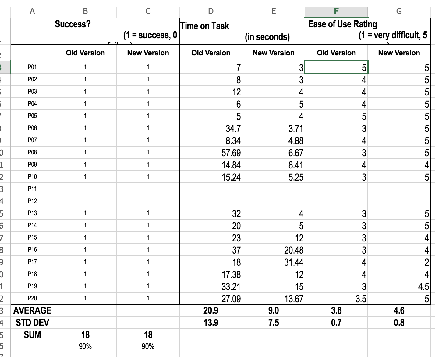
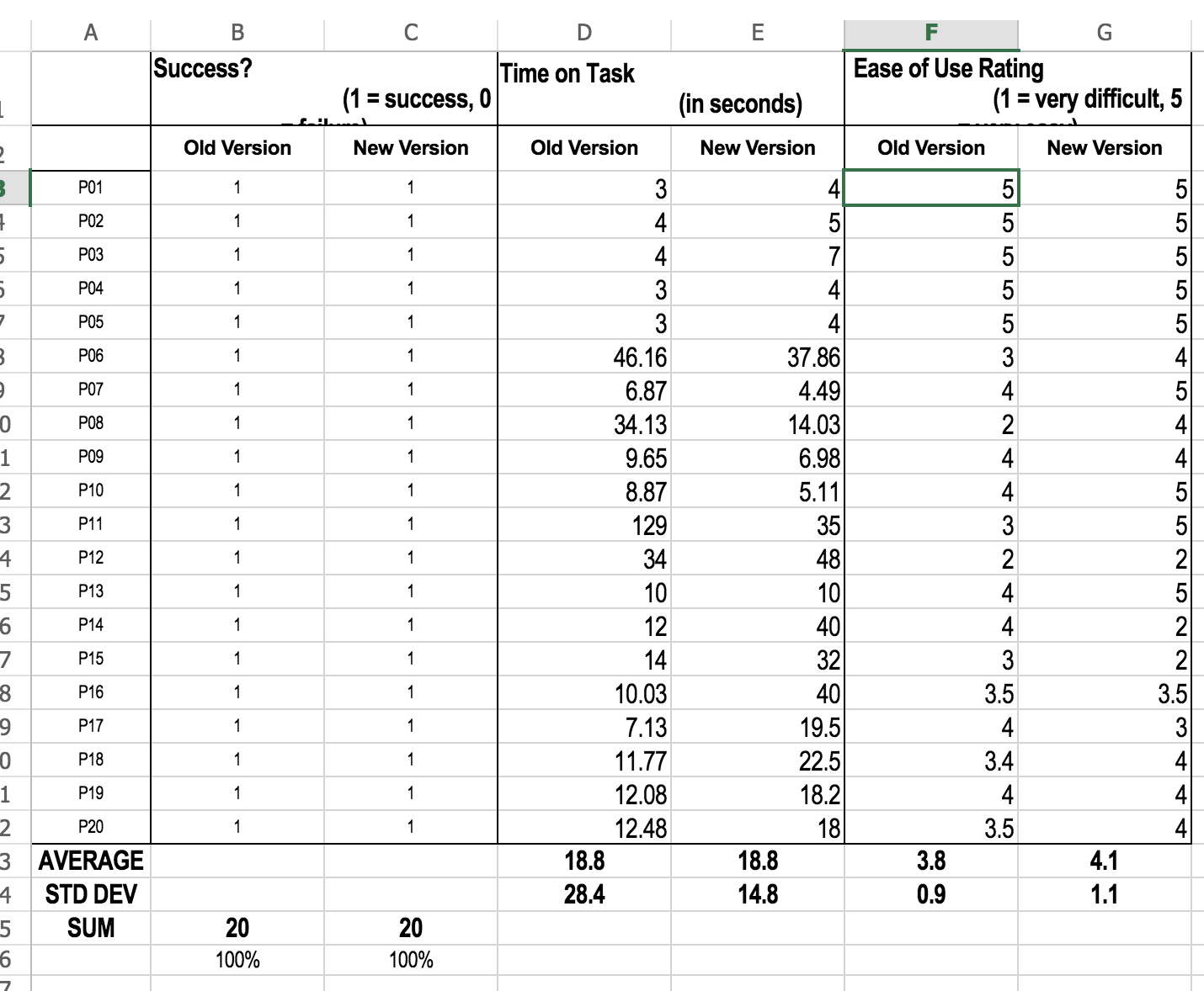
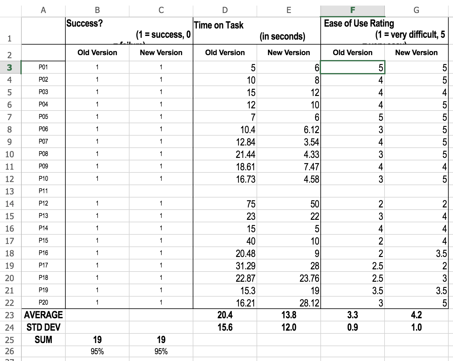
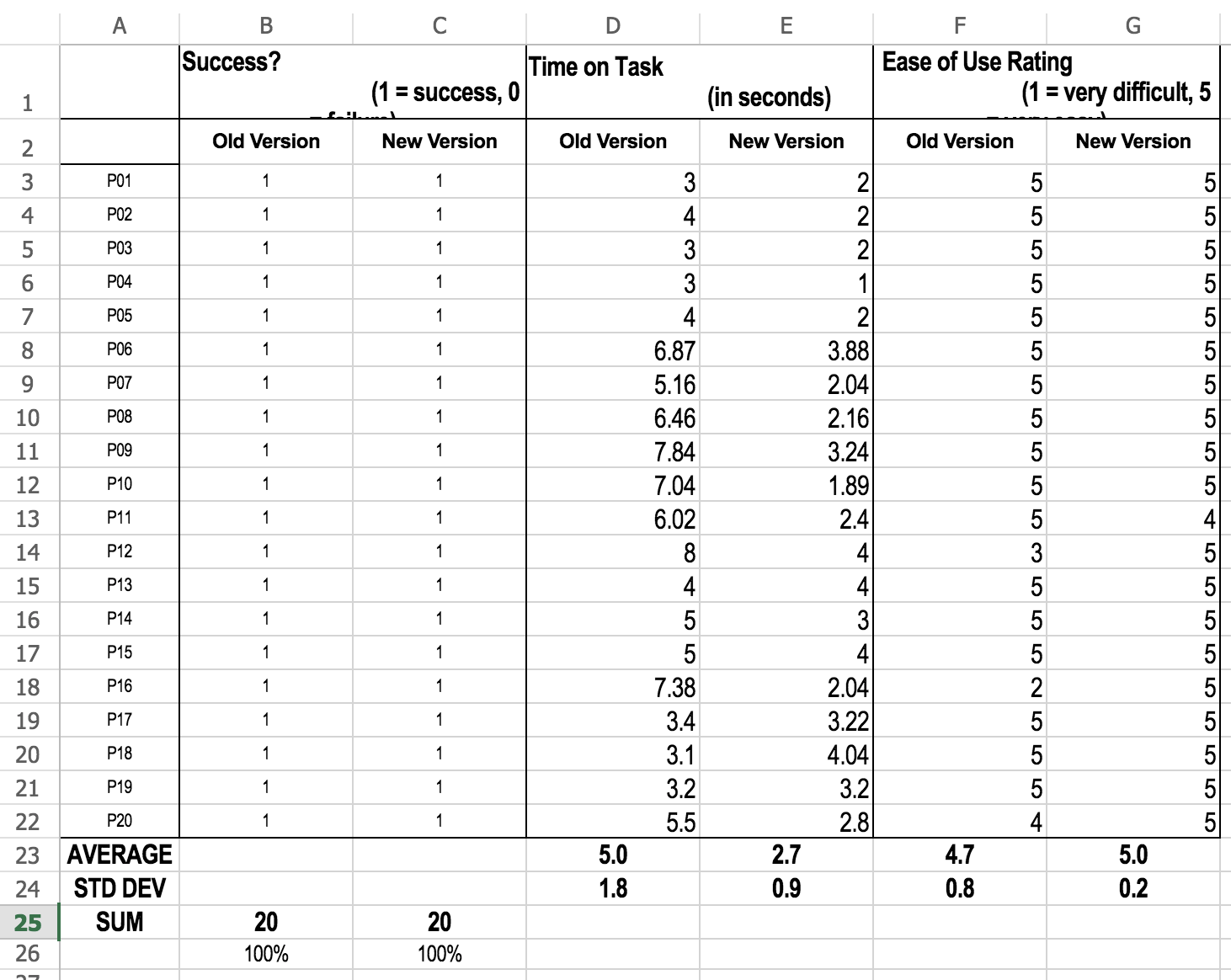
The success rate for completion, with no significant difference in all tasks, increased for three tasks and remained at 100% for two. The time-on-task data showed there were significant differences in all tasks, except when asked to find the supply and delivery charges. Ratings for ease-of-use were significantly higher in the new version for finding the average temperature, usage data, and payment methods. Overall, there were positive improvements on the utility bill from the old to new version.
Data
While both qualitative and quantitative data are open to subjective interpretation to some extent, quantitative tends to be a more objective insight into how a particular experience is performing.
In the case of the ComEd billing system, users were evaluated on several quantitative measures: success / fail rate, time on task, and ease-of-use ratings.
These tend to be typical quantitative measures for effectiveness, efficiency, and satisfaction, but, in less clear-cut cases, the metrics chosen for measurement can be appropriately adapted to the objectives of the study.
After gathering the quantitative data, we evaluated the findings with some statistics, and a few T-Tests and Fisher’s Exact Tests later, the team and I were able to come up with some substantial evidence to show in the report in the previous section.


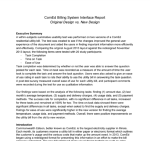
Findings Report
Here is the full report we compiled for the ComEd comparative usability test – including the usual suspects: an executive summary, introduction to objectives of the study, methods used, our findings, and most importantly, the design recommendations.
Above and beyond the quantitative measures in the spreadsheet, the report also goes over qualitative measures, such as observations made by the moderator, non-verbal cues, think-aloud task comments, and also the participant’s response to post-task commentary questions.
Ultimately, the recommendations made were a culmination of all the various facets of the study’s findings, as well as a solid understanding of the vision that internal stakeholders had for the product.
Using design to connect people, product, and business

Follow Me
Email: dash@alum.northwestern.edu
Phone: +1 312 478 7147