Vimeo Creator's Circle
A discovery project to concept a new experience for Vimeo content creators

User Empathy
Interviewed and observed various types of Vimeo content creators to better understand them

Synthesis & Ideation
Reflected on learnings through group de-briefs, affinity diagramming, and the creation of personas and journeymaps

Experience Design
Concepted, tested, and refined design solutions to identified needs through sketching, wireframing, and prototyping

Visual Design
After validating ideas with internal and external stakeholders, I created hi-fidelity mockups and dev-ready documentation
Table of Contents
Project Intro
What we worked on, overview of deliverables, project logistics, & KPIs
Project Intro
View SectionProcess Overview
A quick process overview & how the activities throughout culminated into a proposed set of designs
Process Overview
View SectionEmpathy
What we set out to learn & how we captured insights in personas & journeymaps
Empathy
View SectionLow-fi Ideation
How I translate user insights into initial ideas that can be iteratively refined & eventually shortlisted & prioritized
Low-fi Ideation
View SectionFinal Design Choices
A few examples of fine-tuning the experience to improve primary interactions and secondary events
Final Design Choices
View SectionProject Reflections
Keeping stakeholders informed during the process and aligning on goals
Project Reflections
View Section01
Project Intro
What we worked on, overview of deliverables, project logistics, & KPIs
What We Worked On
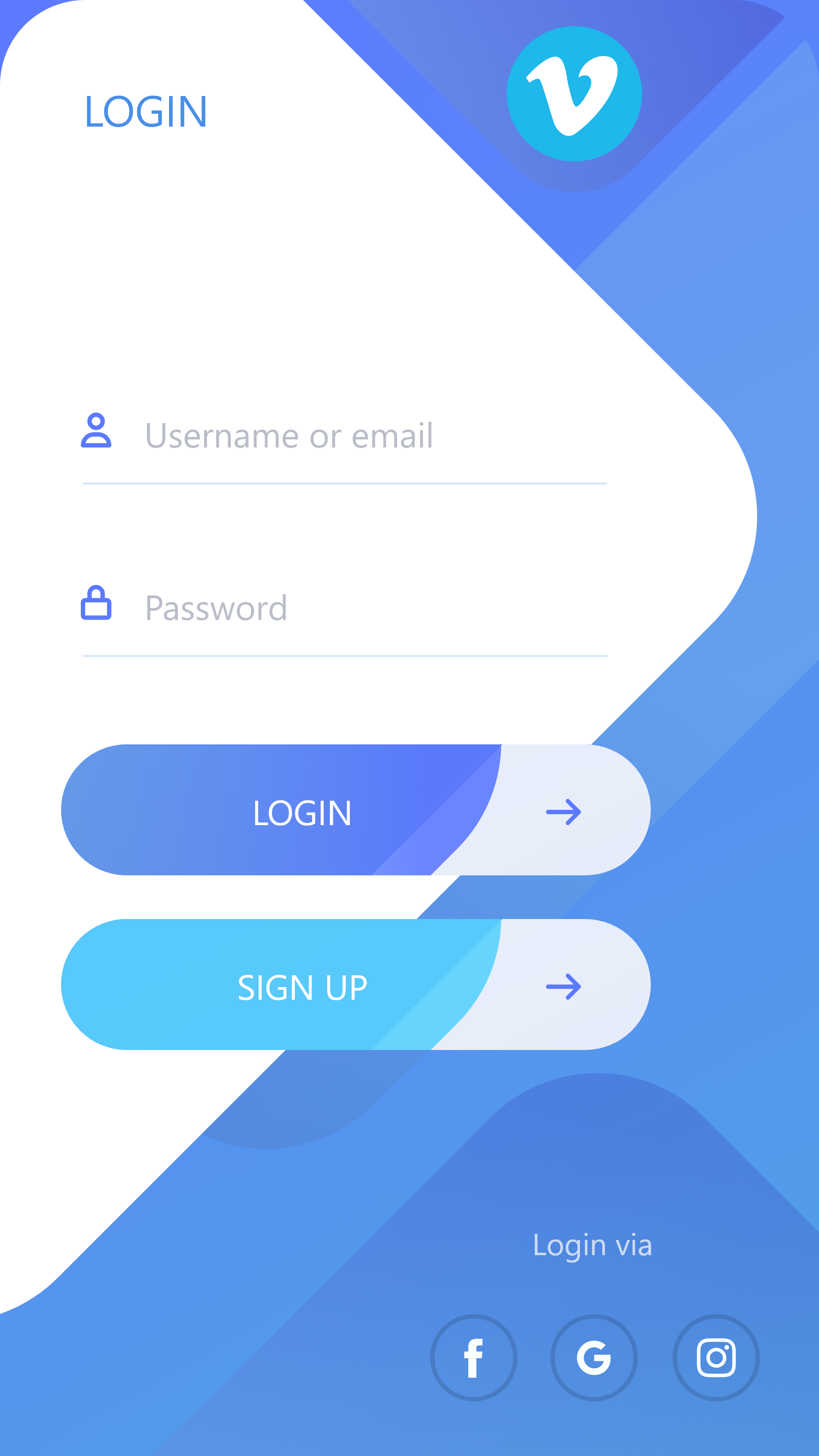
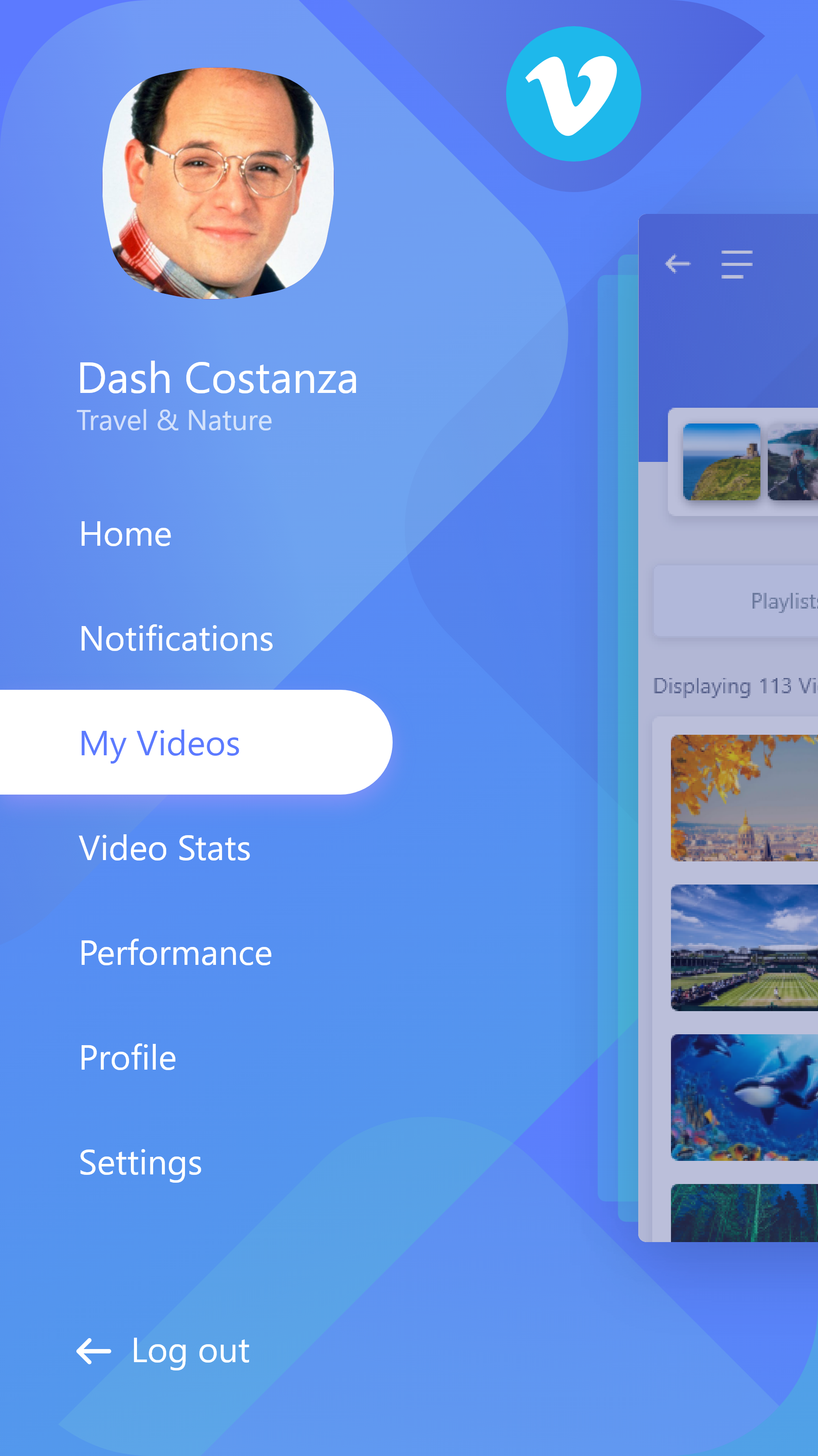
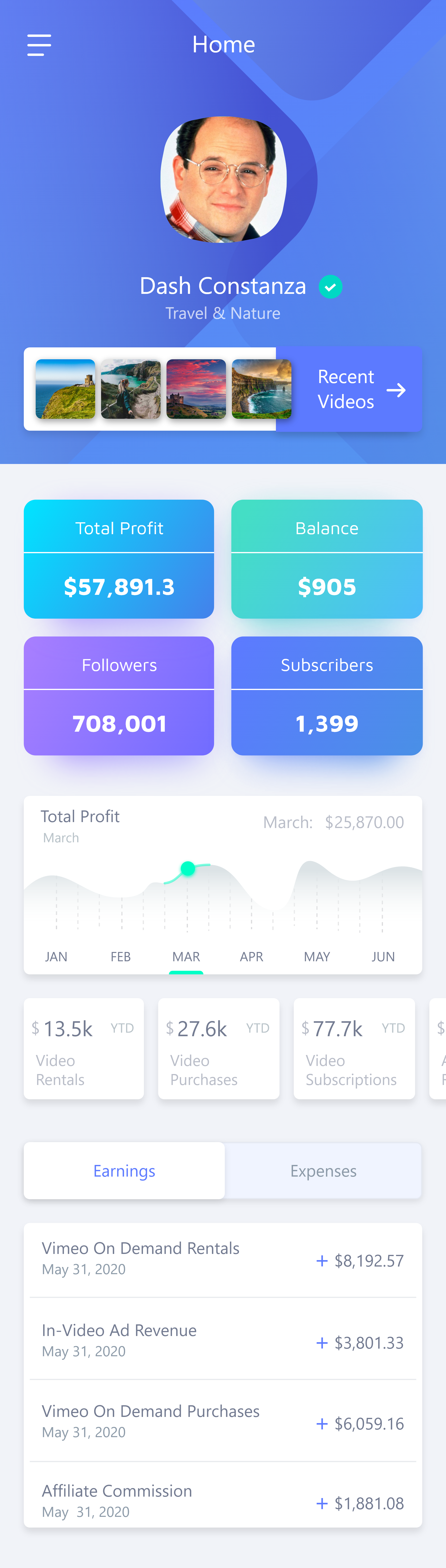
Vimeo was looking to provide their content creators with an improved set of tools, with a focus first on their mobile experience.
I lead the experience design effort to concept and design an iOS app to help creators analyze performance, set/track goals, stay up to date with relevant notifications, and perform other core tasks on-the-go.

Deliverable Overview
Over the course of this project, some of the deliverables I created include sketches/wireframes, hi-fidelity mock-ups, interactive prototypes, personas, journeymaps, user flows, a sitemap, etc.
Here are just a few examples of core deliverables.


Project Info
This discovery project was completed over 14 weeks. This included discovery research, wireframing, prototyping, and hi-fidelity design for the iOS app.
I collaborated with Vimeo business stakeholders as well as a full SCRUM team with engineers (performing a technical discovery analysis), a PM, and another UX resource that acted primarily as the researcher.
I was the lead experience designer but also supported research efforts.
I worked closely with these various folks to make sure design concepts were grounded in business goals, were desirable for our target users, and were feasible from an engineering perspective within the given timeline/scope.
My responsibilities were to lead design and support research.
On the research side, this included collaborating with the UX researcher to define a research plan based on insights sought, conduct interviews/observations, synthesize findings, and create personas, journeymaps, and other insight assets.
On the design side, I lead the full cycle of design from early stage ideation via sketching/whiteboarding/wireframing, through clickable prototypes, hi-fidelity mockups and development-ready documentation.
At the end of the road, we established a new experiential direction for Vimeo’s mobile experience for content creators, validated both by users and business stakeholders.
Because the application has not yet been implemented and launched, KPIs have not been measured — though they have been defined, which I go over in the section below.
Tying Design to Business Impact
Defining KPIs
In order to make sure that the experience we designed actually resulted in tangible improvements, we defined KPIs to be measured once the app launched.
Ideally, we wanted creators to be better able to self-reflect on the content they produce so they could improve future content ideas, set/track performance related goals to stay motivated, and have a quick way to get notified about trends, accomplishments, and other relevant events that could influence their future video ideas.
General User Satisfaction Ratings
Satisfaction ratings received by creators in anonymous surveys that were sent out to Vimeo creators
Increased Performance
If the tools helped creators accomplish their goals and increase views/likes/subscriptions/etc.
Monthly Active Users (MAU)
The unique number of creators using the app within any given month
Daily Active Users (DAU)
The unique number of creators using the app within any given day
02
Process Overview
A quick overview of my process and how the activities throughout culminated into a proposed set of designs
Process Overview
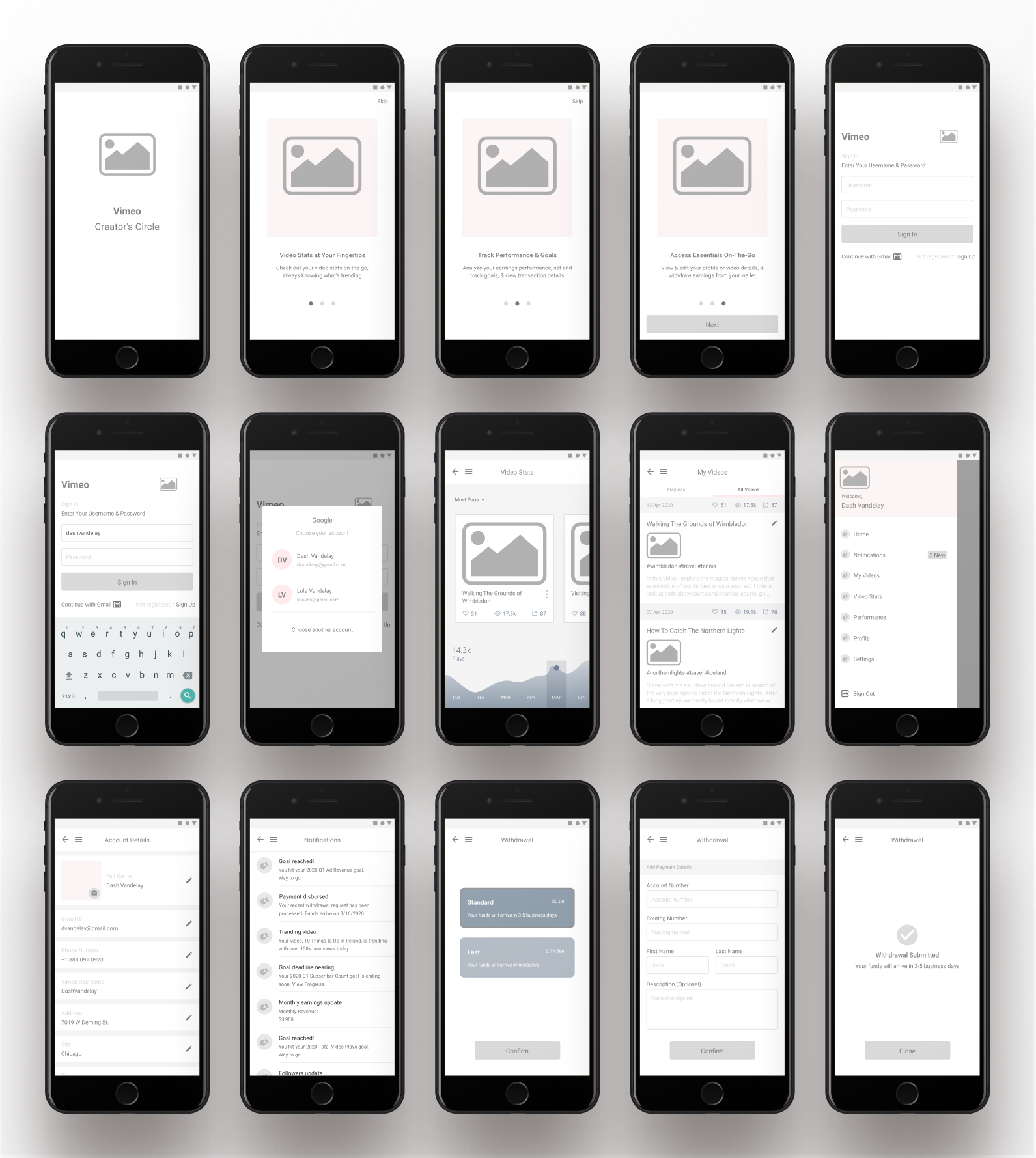
Wireframes & Iterative Refinement
Quickly and iteratively took initial ideas, put them to the test in clickable wireframe prototypes, gathered feedback, and refined until concepts were validated and ready for the visual layer.
Concept Models
As I continually refined initial ideas through gathering feedback on prototypes, I also created and kept updating a concept model to help track and organize viable concepts throughout the process of iterating on various ideas.
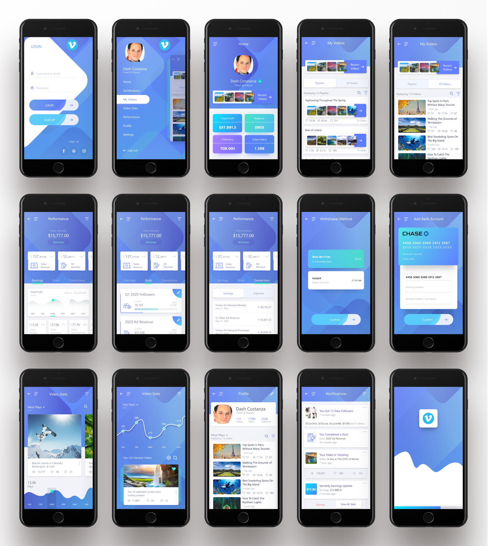
Prototypes & Hi-fi Design
As low-fidelity concepts moved closer to validation, I created hi-fidelity mockups and prototypes and continued gathering feedback and iterating at a more detailed level.
03
Empathy
What we set out to learn and how we captured insights in personas and journeymaps
Intro
My process always starts with empathy. By better understanding our target users and mapping out their processes, pain-points, and future state desires, I’m able to focus my design efforts in a more effective way.
To do this, we defined what we wanted to learn about our target users and how we would go about extracting those insights. Once gathered, we then synthesized and summarized our highlight findings and used them to drive a more relevant set of features for the experience.
What We Set Out to Learn
We took a look at four main categories of questions while empathizing with users through interviews and contextual observations:
Frequent Processes
What do Vimeo content creators typically do and why?
Needs
What do they want that they aren’t getting?
Enjoyments
What sorts of things do they enjoy about the current state experience and want to maintain?
Feature Shortlist
What are some of the features that we can consider essential to the core experience, particularly in a mobile context?
Interviews
Contextual Observations
Insight Themes
Key Findings
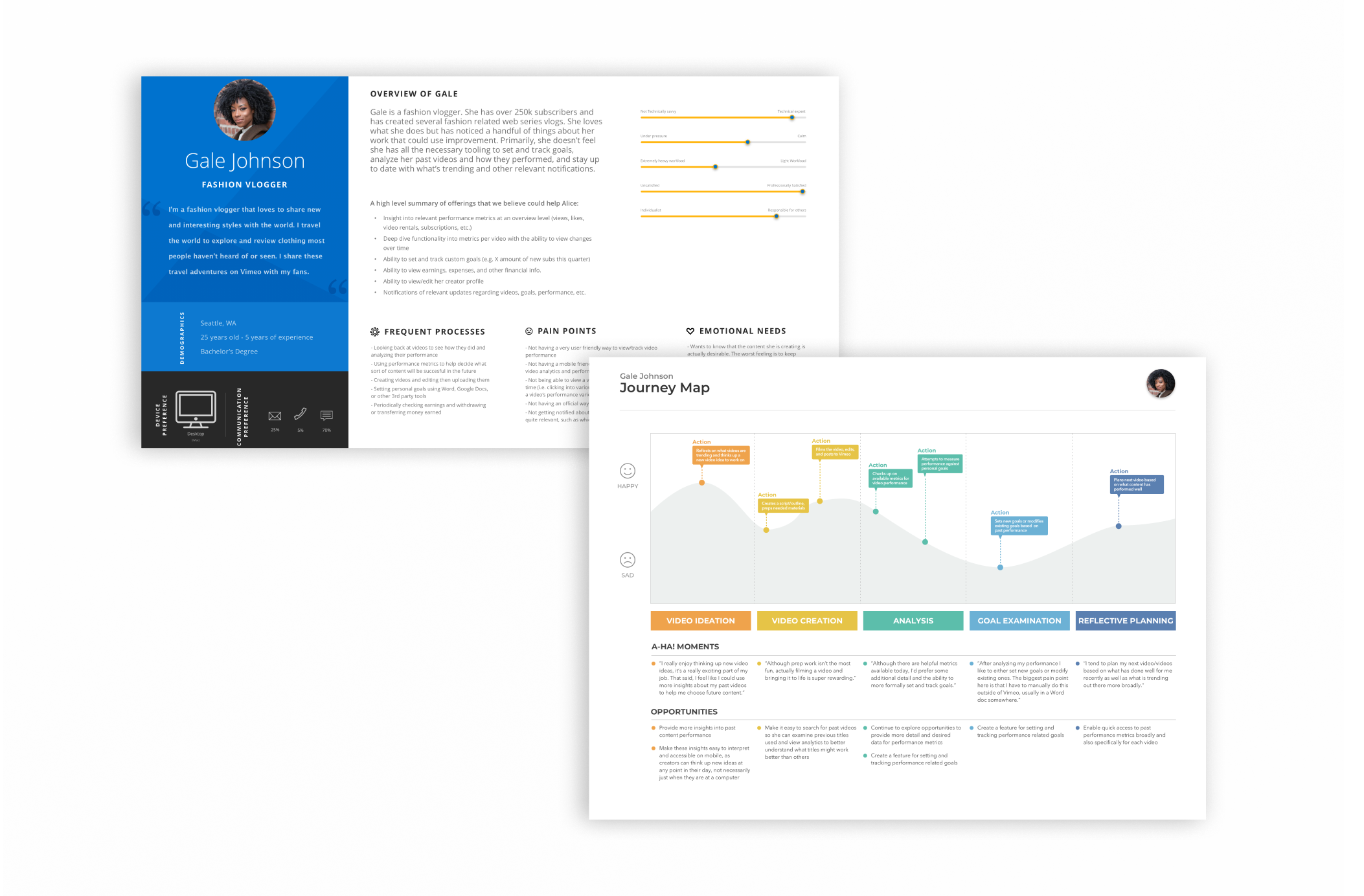
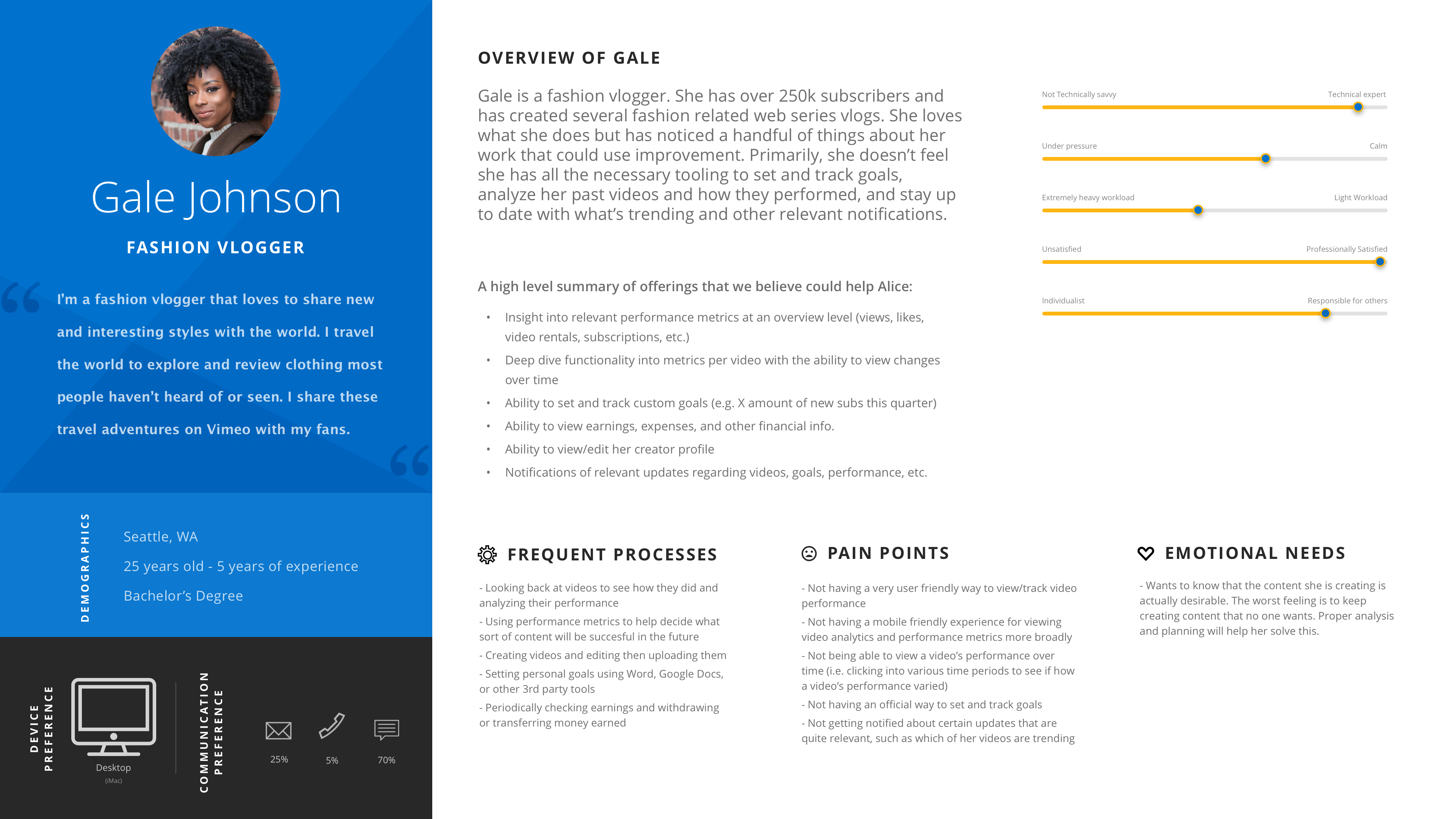
Coming out of the empathy phase, we took our insights and began creating research artifacts to summarize our findings. Two key artifacts that we created were the persona and journeymap.
Some of our key findings were that Vimeo content creators wanted:
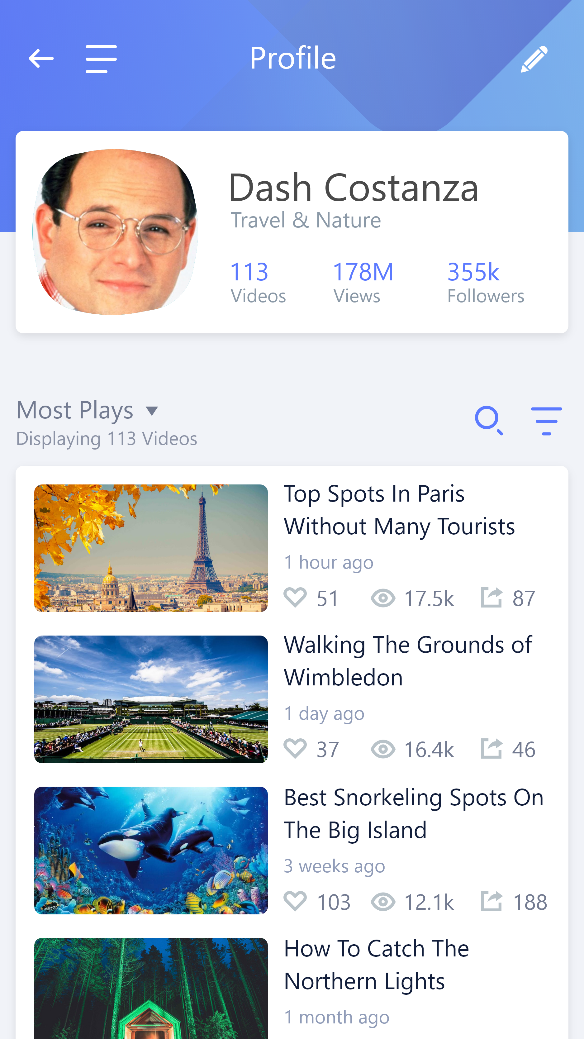
- Insight into relevant performance metrics at an overview level
- They also wanted these metrics at the individual video level with the ability to view changes over time
- The ability to set and track customs goals (e.g. gaining X amount of new followers for the upcoming quarter)
- Visibility into earnings, expenses, and other financial info
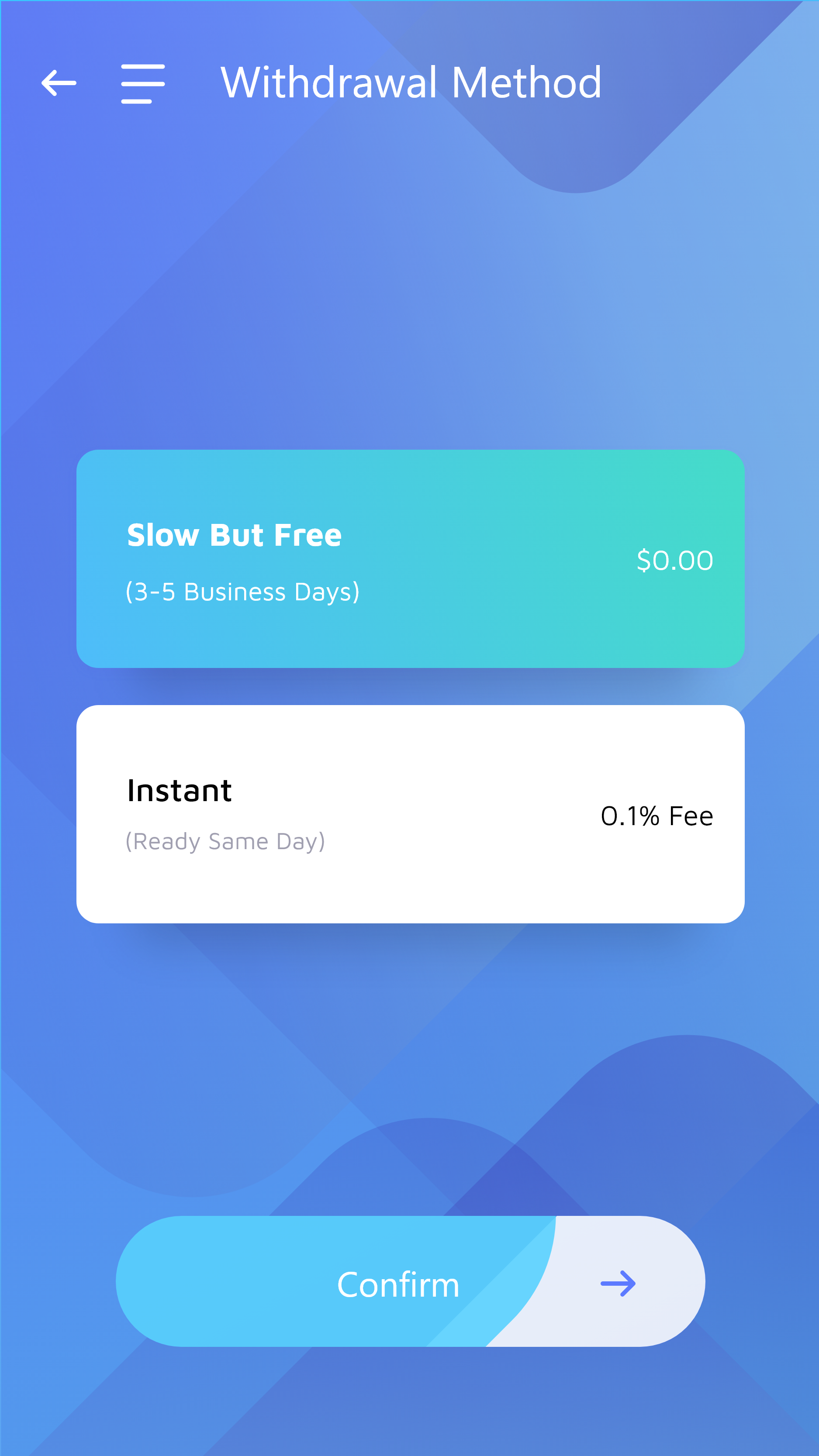
- Certain core functionality carried over from the web experience (e.g. viewing/editing their own profile, withdrawing earnings, etc.)
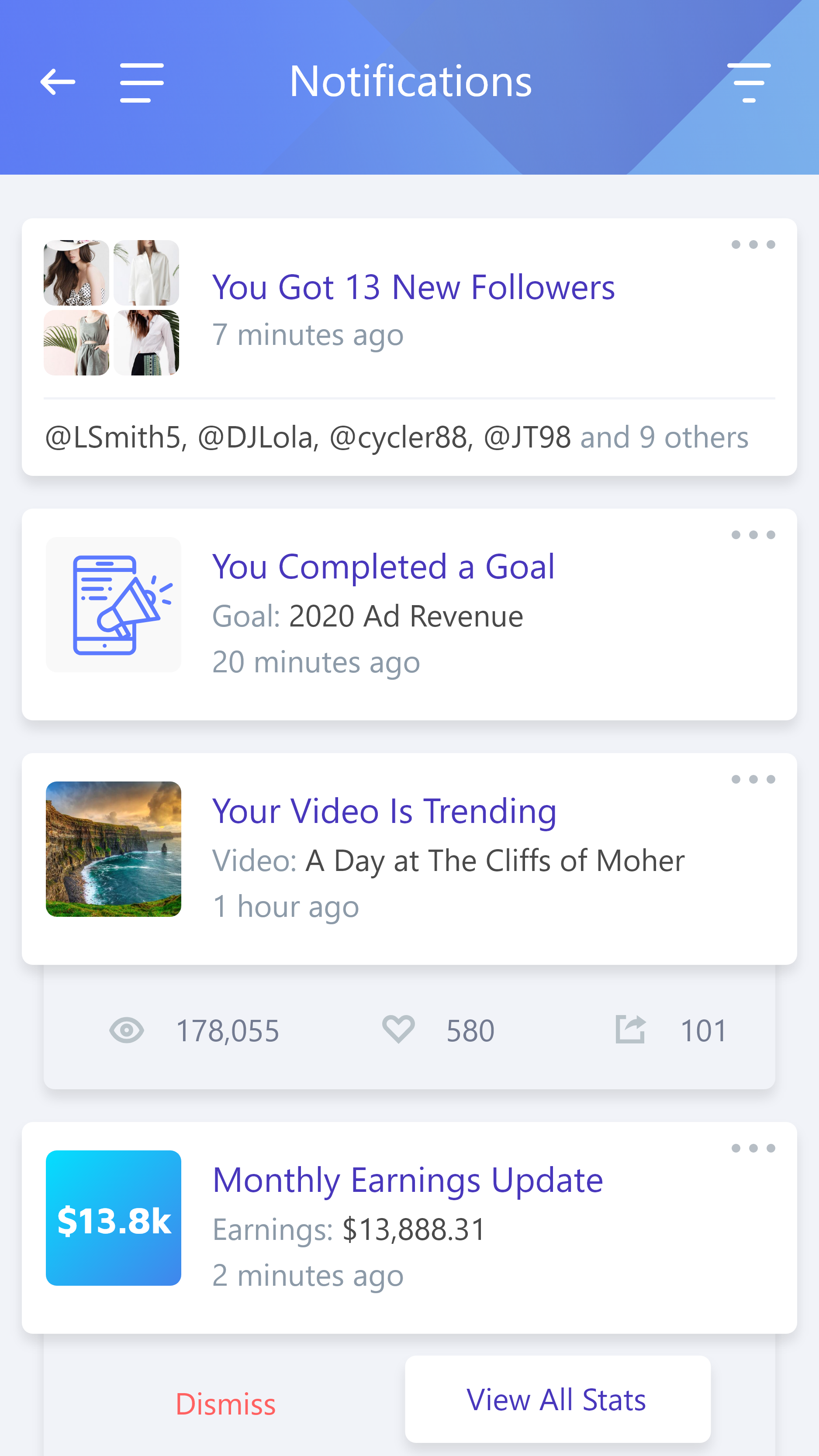
- Notifications of relevant updates regarding videos, goal performance, etc. so they can stay up to date on-the-go
04
Ideation
Using low-fi wireframes to test and iterate on concepts
Intro
After gathering some foundational insights through discovery research and the creation of artifacts such as personas and journeymaps, I then like to rapidly produce many different ideas to test and iterate on.
In this section I will present an example of this process.
Wireframes & Iterative Refinement
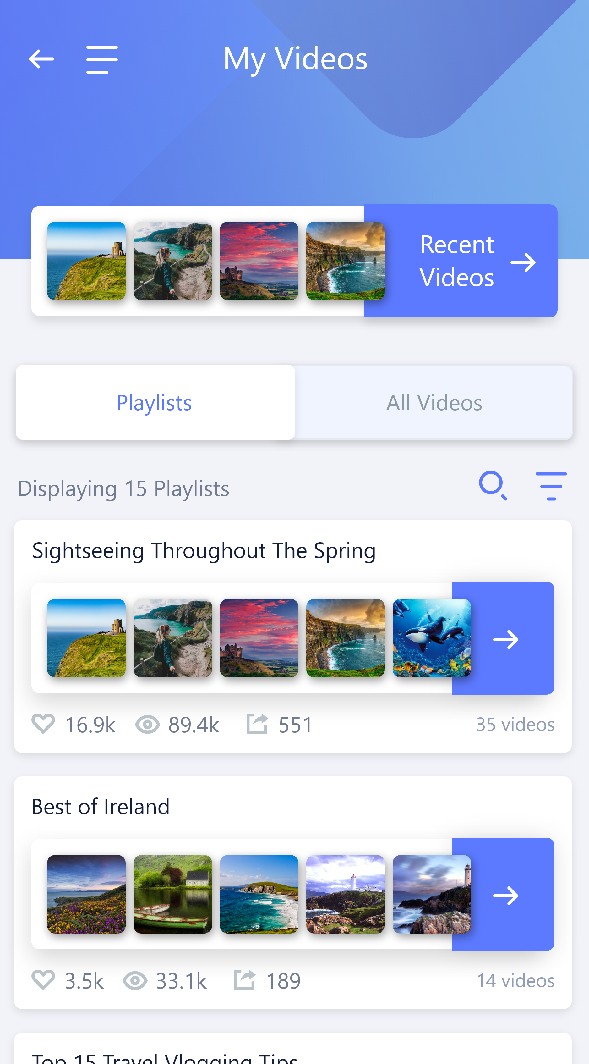
One example of how we iterated on some early design concepts was the evolution of the Performance section.
Essentially, “Performance” contains three concepts (described below): “Earnings”, “Goals”, and “Transactions”, and so we wanted to figure out the best way to organize these related concepts and most efficiently allow creators to discover and interact with them.
Wireframe
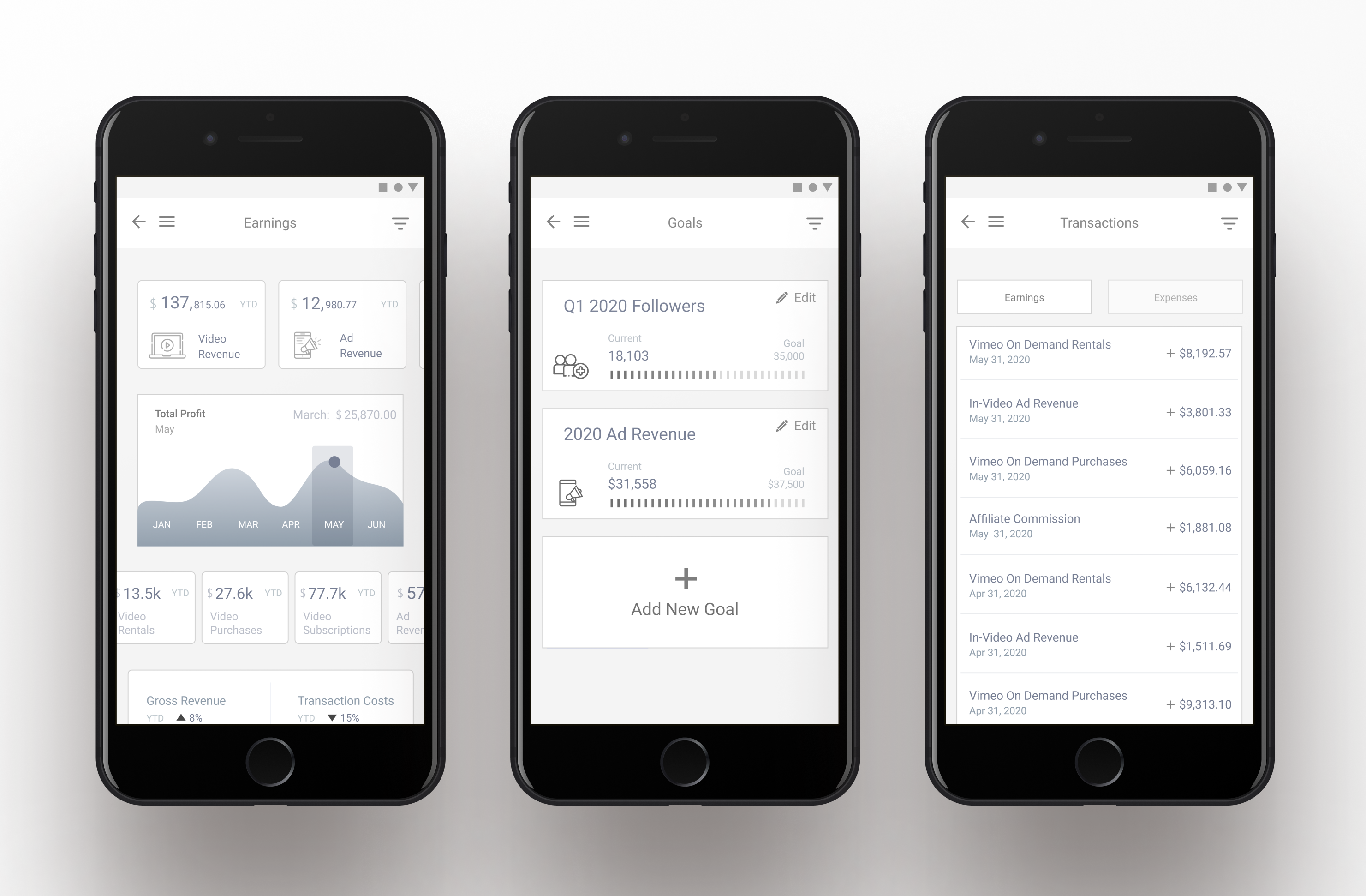
Final Design

To summarize the idea of each concept:
- The “Earnings” section allowed content creators to check up on their various types of earnings
- “Goals” allowed them to define and track custom goals (e.g. gaining X amount of followers in a given time period)
- “Transactions” showed transactions for both earnings and expenses
Initially, we had separated these three concepts into different pages, each requiring their own navigation link.
However, I really felt the need to minimize the length of the navigation menu if possible.
My philosophy is, particularly in a mobile context, larger navigation menus tend to suffer from decreased user discovery of functionality/content.
So, what I ultimately ended up doing was combining these three related concepts (“Earnings”, “Goals”, and “Transactions”) into a single page.
To do so successfully though, I needed some way to properly divide them up within a single “page”.
The solution was the in-page navigation tabs that you can see in the final mockup.
After testing this idea out with users, the consensus was:
1) This grouping of the three related concepts within a single view made sense
2) The method of interaction for tabbing between the three sections within a single page felt comfortable and intuitive
Given the feedback we received on the final prototype, we went with this design as it was a solution that:
- Increased discoverability
- Reduced the amount of items in the navigation menu
- Grouped related concepts together in a way that was in line with the mental model of creators
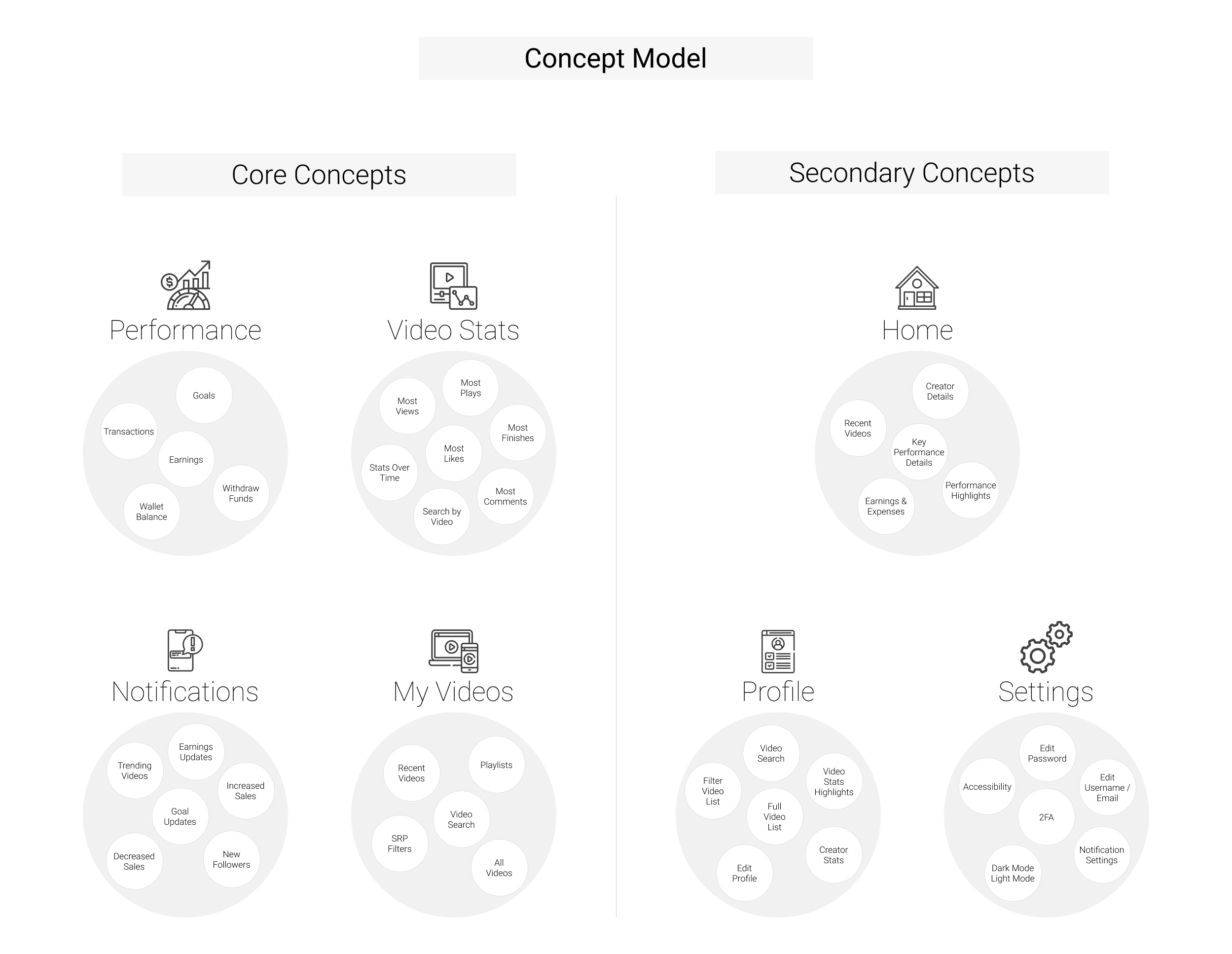
Concept Models
As we shifted from research to design and continually refined initial ideas through gathering feedback on prototypes, I created and repeatedly updated concept models.
These concept models were based on insights gained from testing our prototypes, as well as a card sort that we ran a few times as the project progressed and we started to gain a firmer understanding of what all would be included in terms of pages, features, and content.
I find that creating concept models not only helps me keep a broader, more organized view of the many evolving pieces to the puzzle, it helps other internal stakeholders also stay up to date with how the overall experience is shaping up.
This is super helpful from a collaboration perspective because otherwise engineers, product managers, business stakeholders, and other team members might not see the vision and how things fit together as it all continues to develop.
I have found that it’s good to keep teammates apprised of conceptual developments prior to the screens having been fully designed. Giving them this early look into the draft concepts of what will comprise the experience helps keep them in the loop and also allows them to contribute insight early on at a structural level, which can be helpful.
The above concept model represents the final structural direction that we landed on in terms of the pages needed, as well as core features within those pages.
05
Final Design Choices
A few examples of fine-tuning the experience
Intro
In this section I’ll talk about a few examples of fine-tuning interaction design by prototyping and testing several approaches to solve user needs and discuss considerations that drove our final design decisions.
Example #1: Interaction Design for Video Stats
Iterating On Several Key Interactions Based On Internal & External Feedback
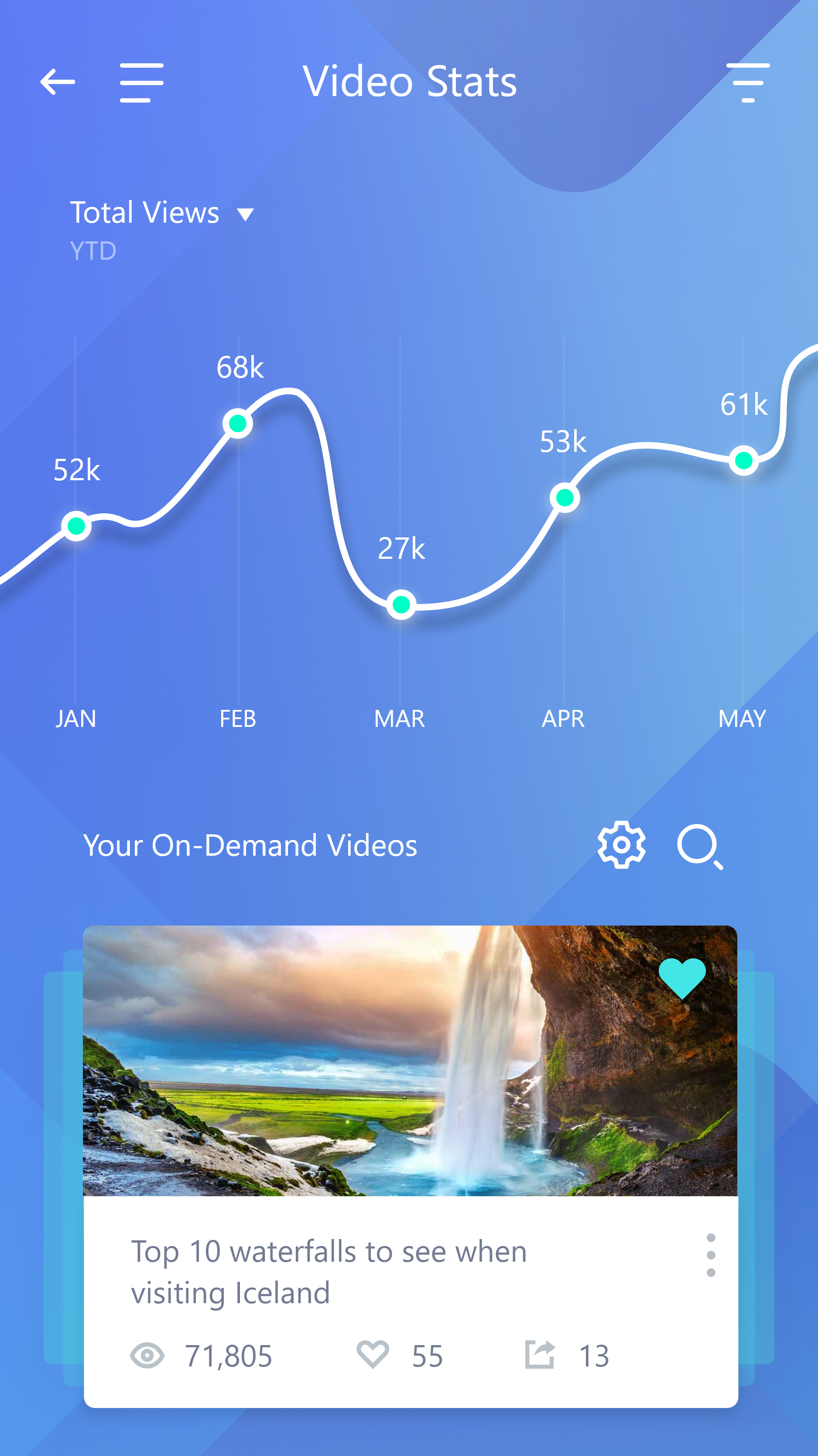
One of the core features to the Vimeo mobile app was to be able to check up on video stats. This included things like total views per video, most plays, etc.
Initially, we came up with the design on the left, but after some continued testing and gathering feedback, we landed on the design on the right.

While gathering feedback from users as well as internal stakeholders (devs, PMs), I based the final design decision on a few key insights:
- From an engineering perspective, the custom dev work required to bring to life the interactive graph for stats, as well as the card components for videos in the first design (left) would be very expensive. This wasn’t necessarily warranted by any noticeable increase in user value.
- In contrast, the design on the right only required us to slightly modify several widgets that we found in a widget library for Flutter (the development framework we were planning to use for the UI), and so it was much more feasible and time effective.
- User feedback pointed towards the side-scrolling list of cards in the final design (right) being more intuitive than the swipable list of cards at the bottom of the first design anyway.
- We tested 35 users via usertesting.com on these two prototypes and 27 of them preferred the method of interaction on the right (with many verbal comments being made about that method being more intuitive).
- Beyond that particular interaction, we did not find users having any real issues performing the tasks they were prompted to complete within the prototype (taking a look at several videos, changing the filters, and searching for a video called “Paris highlights”).
Example #2: UI Animation
Offsetting Less Desirable Events With Visual Flare
There are certain events that unfortunately must exist within an experience, such as waiting for the app to load.
No one looks forward to these and they inherently drain the user’s reservoir of goodwill.
That said, I believe the negative impact of these events can at least be reduced by how they are designed.
Beyond simply the engineering-sided solution of finding ways to make the app actually load/run faster, I find UI animation to be a good tool for making the process of waiting somewhat less painful.
In the short clip above, you can see an example of the loading animation I designed while the user waits for the app to startup. I created micro interactions similar to this in multiple areas of the app that also required loading, such as processing user actions that required sending/receiving data.
06
Project Reflections
Navigating Stakeholder Sensitivities & Exploring Distinct Experiences Across Web & Mobile
Keeping Stakeholders Informed During The Process
One challenge that I faced on this project was managing the expectations of stakeholders during our research and ideation phase.
We had several business stakeholders over at Vimeo that were not necessarily familiar with a human-centered design process.
Consequently, at times it felt like they expected a final solution without so much time spent prototyping, testing, and iterating.
What I did to help mitigate this issue was:
- 1) Continue to bring up and explain the human-centered design process and why it was valuable.
- 2) Actually show them how the process was resulting in new/changed ideas. Particularly, showing them the way the wireframes changed each iteration and what specific user feedback informed those changes. This really seemed to help them see the value in the process.
- One example of this was how we iterated on the interaction design and organization of content within the “Performance” section. They did not at first understand why we made the changes that we did (explained above in the “Ideation” section) but after sharing the specific user feedback that inspired those changes, they were much more convinced.
By doing these two things consistently, particularly what I did in point #2, they began to better understand and buy into the process.